Listen Up! Sound Therapy Toy
UX Research | Prototyping | Accessibility
Listen Up! is a tabletop sound therapy toy that helps children with hearing impairments identify and match sounds with its source. The sounds are randomized to allow the game to be played multiple times. This project is currently still in progress.
Listen Up! was initially developed for the Strivright Auditory Oral School of New York. Occupational therapists (OTs) can use Listen Up! as a sound toy for children ages 3-5 years with:
Spatial, partial, severe, and profound hearing loss
Cochlear implants, hearing aids, and other assistive hearing devices
Auditory processing disorder, where there is an overt disconnect between hearing and processing sounds
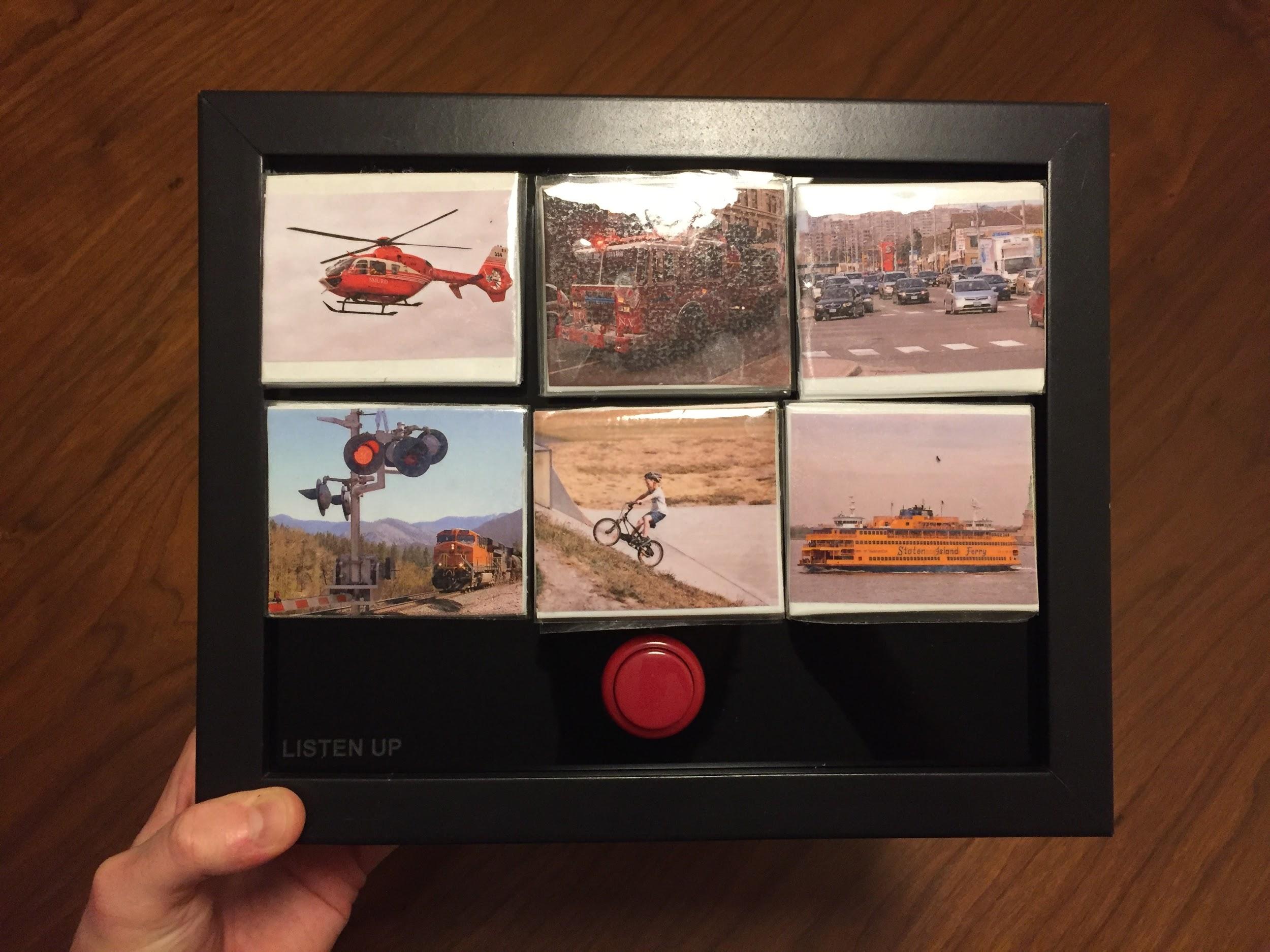
Version 1 of the game includes the following sounds: firetruck siren, helicopter, car horn, bike bell, ship foghorn, train crossing signal.
Under the Hood
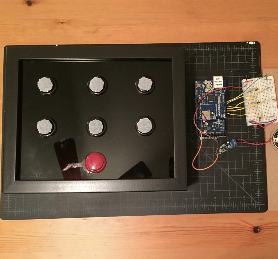
Arduino Due
Arduino Ethernet shield + SD card reader (32GB SD card)
LM386 audio amplification module (to make it LOUD)
7 arcade buttons (1 red, 6 black)
On/Off rocker switch
On/Off LED
Initial Prototype
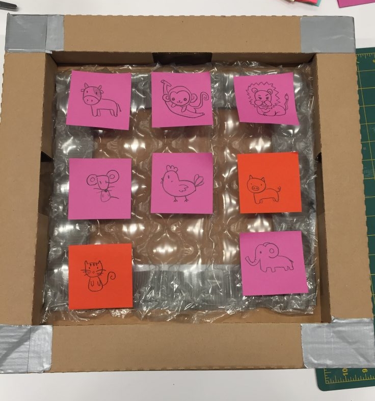
Our first prototyping sessions was very helpful in visualizing our soundboard. Nine tiles will be placed on the board. Each tile has its own image in a certain category (animals, transportation, etc.). The tiles can be rearranged on the board to avoid memorization of sound locations.
Our first iteration of game play: The OT will turn the game on and press the red button. A sound will play (ex: cluck-cluck-cluck). The student then presses the tile with the corresponding image (ex: chicken). If the student made the correct selection, the board will provide positive auditory feedback (ex: cluck-cluck-cluck, chicken! You did it!) If the incorrect answer is pressed, the noise will repeat and the student tries again.
Second Prototype
Our second prototype is built from a frame of a shadowbox that allows for front and back-loading. We removed the shadowbox glass window and replaced it with acrylic cut to size with holes for the arcade buttons.
Our first set of tiles were made from craft foam and adhesive plastic, which will be improved in future iterations.
Our second prototype of the game does not include automatic auditory and visual feedback when correct answers were placed on the board.
The flow of our second iteration of game play: The OT will turn the game on and press the red button. The student will press one of the black arcade buttons. A sound will play (ex: cluck-cluck-cluck). The student will select a foam tile that matches the sound and places it over the arcade button. If the student made the correct selection, the OT will provide positive auditory feedback (ex: That’s correct, it’s a chicken. You did it!) If the incorrect answer is pressed, the OT will prompt the student to try again.
Usability Testing and Demo
Key Takeaways from Usability Testing
Trouble with the big red button.
What is the red button for?
Button needs to be labeled “press to begin” for clear instructions
Adjustment: Users now hear “Let’s Play!” when red button is pressed to confirm the game is ready
Tiles need to be more durable.
Students may pick at frayed edges of tiles
Should images be clip art or photographs?
Consider noises pertinent to the user’s environment.
Users preferred a train crossing symbol vs a train whistle
What about the subway, instead of a train?
Bicycle: use image of bike in traffic instead of child in suburban setting.
What happens if the student has never heard these sounds before?
OT may want to press all buttons for the student to hear first before attempting the game
Is touching a button with the scratchy side of the Velcro uncomfortable?
Could be an issue with students with sensitivity to tactile input.
Levels of difficulty
What kind of levels can we build into the game to support users who may not be able to process 6 sounds and need to narrow down the game?
Future Considerations
Due to time constraints, we were not able conduct usability testing with our target audience. Testing our target age group may reveal other opportunities or pain points. We would also like to further iterate on the game play and process for matching sounds to tiles, without the need to cover up each arcade button with corresponding image.
Now:
Game allows students to test knowledge of six transportation noises, including: car, bike bell, train, helicopter, ferry, firetruck.
Requires occupational therapist to provide feedback on correct/incorrect answers.
Next:
Improved tiles for durability and quality.
Different switches to connect tiles to board without the use of velcro.
Improved game board with softer edges.
Additional sound categories beyond modes of transportation (animal sounds, sounds around the home).
Later:
Multiple sensory indicators such as lights for narrowing down options and correct answers
Automatic answer detection and feedback (ie: “Great job! that’s what a cow sounds like!”)
Include levels of difficulty, set the game to play with fewer tiles at once


